A modern mobile app for a historical dating service.
Client
Aller Media
Role
Concept & UX Design
Duration
June 2018 - July 2019
Outcome
Small but steady Beta user base • increased engagement • new visual identity
Access
Open
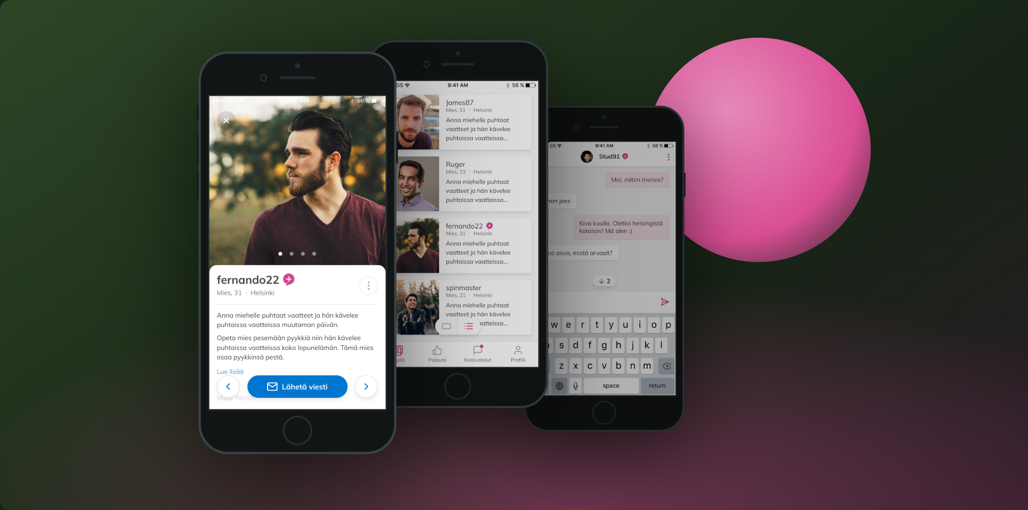
TREFFIT BETA APP - where one can find and get to know potential dates
01 — Context
The Finnish dating service, Treffit24, has been around for almost 2 decades, and it feels like it. As it exists only as a web application, the client wanted us to extend it into a modern mobile application, to help reach the business goals of:
reaching a new audience via the App and Play Stores
attracting more women to the service
increasing premium sales conversions
How might we increase love-seekers engagement to find a significant other - and eventually delete their profile?
02 — Discover
What I did
Qual research: interviews, concept tests
Quant research: polls, surveys, CS feedback
Benchmark
Users insights
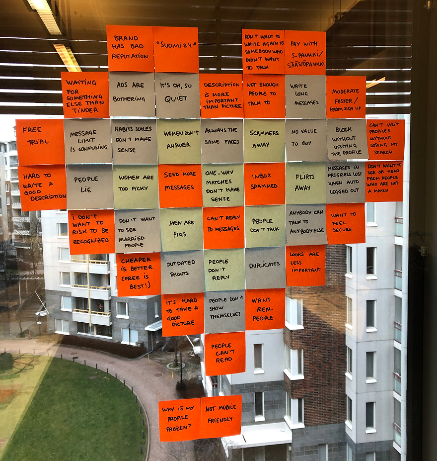
USERS INSIGHTS IN VIEW FOR THE WHOLE TEAM — to make sure everyone is in touch with users needs
A smart service that learns and curates content, instead of always seeing the same few profiles
Not another Tinder
Stop the open messaging to anyone
Icebreakers
Real people with real names, and their faces
In their words
In their words
“
Treffit has been awfully quiet this year, and many people have said that.
Woman, 61 · Interview, 2018
In their words
“
[Writing about myself] is the most difficult thing. That’s what I hate, I absolutely hate it.
Woman, 71 · Interview, 2018
Technical constraints
Treffit24 shares its architecture with Suomi24, its parent service, so we couldn’t fundamentally scrape everything and start from scratch.
03 — Explore
What I did
Service blueprint
User flows and wireframes
User tests
Service blueprint
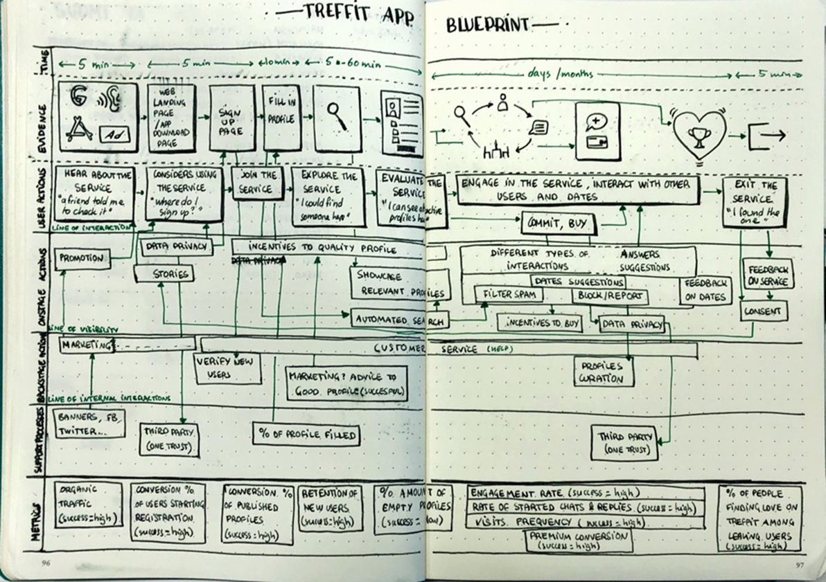
With the help of my whole team: business, development, marketing, sales, and analytics, I ideated a service blueprint.
From the first version, I iterated and detailed it during the following months, and made it visible to our stakeholders by stapling it to a wall. Tape was too weak for such a large and heavy document.
THE FIRST VERSION OF THE SERVICE BLUEPRINT — and also the simplest
With her massive effort to understand complicated legacy system and converting it to a modern mobile app that users would prefer she really impressed me and the whole team. Alice is well organised, she has eye for details as well as for big picture.
Marketing Manager - Treffit24
Process flows
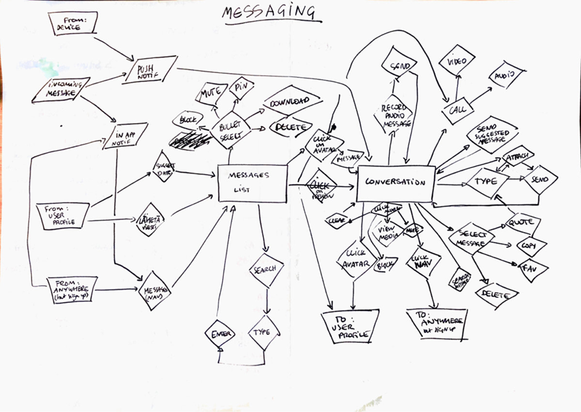
I mapped possible interactions for the different stages of the user lifecycle.
The maps includes basics functionalities but also new ideas to test out.
AN EARLY PROCESS FLOW FOR MESSAGING — it gets hairy, quickly
Concept sketches and wireframes
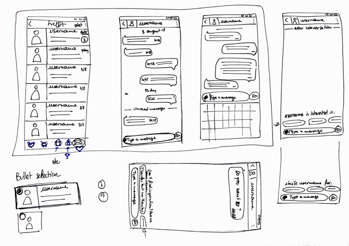
From the process flow, I sketched paper wireframes. They include the basics, but also some ideas to test out.
EARLY SKETCHES FOR MESSAGING — including new ideas like reply suggestions (bottom) and date preferences (top)
User validation
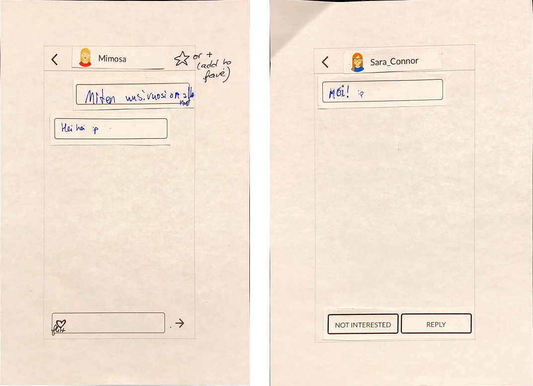
I ran some rounds of user tests to try out low-fidelity concepts (picture), or test usability on high-fidelity prototypes.
I also leveraged our web service to A/B test some concepts; some other ideas where A/B tested straight into our Beta app.
A FUN WAY TO TEST WITH PAPER PROTOTYPES — low fidelity, and accessible for anyone to interact with, comment and annotate
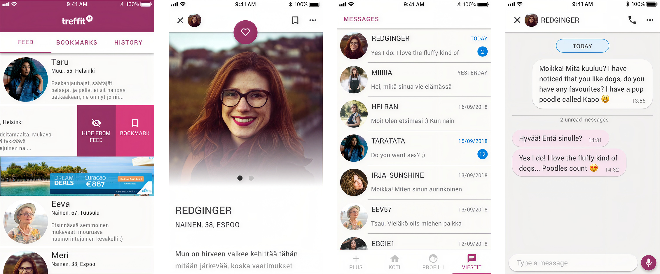
Early visuals
With the app, we also wanted to renew our brand identity. As a junior service designer, I was quite out of my depth!
My mocks were visually good enough for testing the concept, but not for implementing. From there I became art director for a UI design consultant.
IS IT A WIREFRAME? OR IS IT A READY DESIGN? — maybe it's neither
04 — Deliver
What I did
Art direction
Handoff high-fidelity design
Developer support
Implementation planning
Art direction
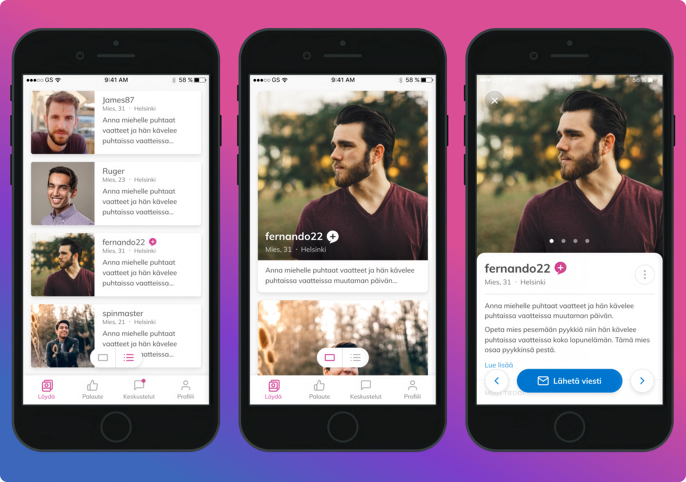
While I wasn’t anymore responsible for producing high fidelity design and refreshing the brand identity, I was in charge of directing our external designer, and supporting the developers.
FRESH MOCKS WITH A NEW VISUAL IDENTITY — the new visual identity was implemented in the app, and also in the web service
Beta app and MLP (Minimum Lovable Product)
What I believe is pivotal for any business to succeed is to have someone, like Alice, to bring out the voice of people to the development team. […] The data Alice provided for the team was not only helpful to prioritize, but also crucial to make the service better. Her organisational and analytical skills as well as her ability to work as a facilitator to any brainstorming, makes her an unique package.
Product Owner • Treffit24
We started with a very small Beta app, fully dependent on the web service, where users could only chat (continue ongoing conversations).
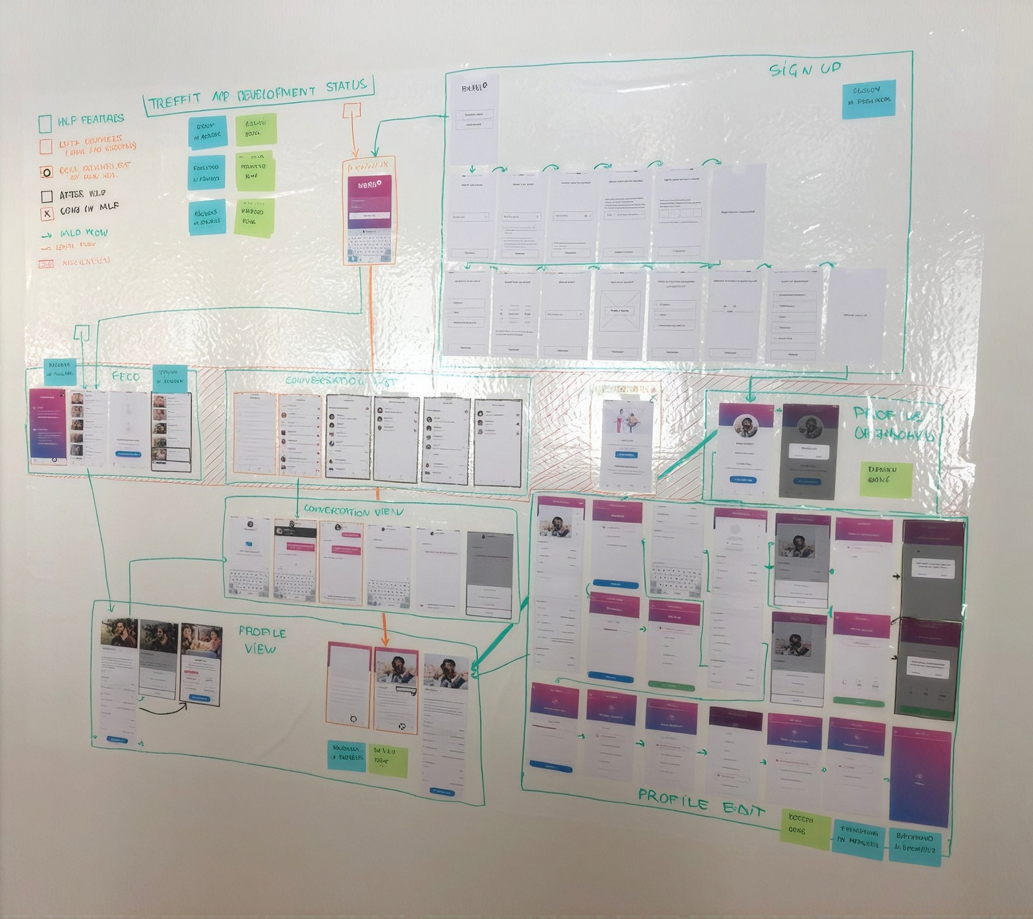
We then added features phase by phase: feed, view profile, edit profile… and I made sure that the design and dev status was visible to the whole team in our space.
THE SCOPE ON THE WALL — with designs at whatever stage they were for each feature, and other annotations to show the status
“[Alice] is a great team member and always ready to help the teammates. She is one the most organized person I ever met in my life.”
Fullstack Developer • Treffit24
05 — Results
What I did
App analytics monitoring
App feedback
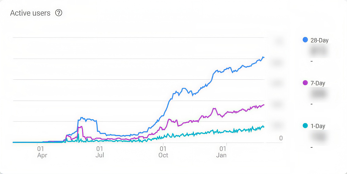
Steady user base
in our native iOS and Android Beta apps
Increasing engagement
over time and compared to the web service
ACTIVE USERS — showing the growth of our Beta app
Unfortunately, when the mother company Aller Media, sold the product and team to City Digital in January 2020, priorities changed and the app never made it out of Beta.
06 — Learnings
Anti-personas
I briefly worked on personas - mainly from a marketing approach. I realised that it was useful for us to also build personas of users we wanted to get rid of (the pervs, the stalkers, the scammers), to design a user experience that would turn them off.
Project management
We had good team dynamics, yet project management was difficult as we had 2 to 4 developers working simultaneously on at least 3 products at the same time, all the time. I worked closely with my Product Owner to try different methods and tools.
07 — Team
Core team
Alice • Service UX Design | 2 to 4 Developers | Product Owner | Marketing Manager
Accountable
Head of Digital Services
Contributors
UI Designer
Consulted
Data Analysts | Tech Lead | Suomi24 team (Product Owner, 2-3 Developers) | Dating service users